Hippasus Gurgles: “The Average Comic”
On alternating Fridays, Michael Carlisle examines the world “outside” sequential art to find… more sequential art. Expect mathematics, a bit of madness, and a dash of pessimistic optimism.
Previously, I discussed infinite sequences; this time I would like to give an application that has changed the way humans interact with the world. And I’d like to play with comics.
One of the most important results from mathematics of the last 300 years is called the Law of Large Numbers.
Taking the sequence of sequences that is a comic strip “series” – the body of work of that strip – I propose a bit of fun.
(If you want to skip the text and go straight to the images, here you go. I’ll understand. Otherwise, read on, Faithful Lurker.)
The theorems referred to by the term Law of Large Numbers (LLN) have to do with the average (arithmetic – add ’em up, divide by how many) of a sequence of independent, identically-distributed random variables (for short, IID RVs… think coin flips or die rolls – each has the same chances and none affects any other) converging to the mean (probability average) value of the random variable. For a quick example: if you roll a 6-sided die, assuming each side should come up equally likely, its expected value  is the probability average of all the values (here all equally likely):

The LLN says that, if you roll the die over and over again, the average of all those rolls gets closer and closer to  . Here’s a quick experiment. (Yes, I actually DID roll a real, physical six-sided die THIS many times, Just For You, as though I was back in high school. I thought the Doc would approve.) I’ll call the nth sample average — the average over the first n rolls —
  . What the LLN says is that, as n gets bigger and bigger (a LOT bigger),
  will get closer and closer to 3.5 “with probability one”. Almost every time. (As long as you don’t cheat… and, you might expect that, up to a certain point, the sum gets bigger or smaller. And you’d be right. This is the ONLY way you win in Vegas – quit while you’re ahead.) This basically means that you won’t keep rolling a 6 forever and ever, or flipping heads after heads after heads with no tails ever.


Believe me (with only one example)? Now, back to comics:
Extremely False, but Useful for the Purposes of This Post, Simplification: Assuming that every individual comic is independent of any other, with a large quantity of an artist’s strips of the same dimensions, we can compute an approximation the “average comic” of that work.
This is clearly not the case. What the hell, though, right? It’s a simple model. Crunch the numbers and sell it.
This is where your bailout money has gone, folks. People getting paid seven-figure salaries to make wild assumptions about large quantities of correlated data, based on little evidence besides “the mathematical models looked pretty” and gave simple, “easy-to-understand” numbers in the end. I’m not expecting that DC or United Features or anyone else are going to go under because of my little “experiment”, though, so with that said……..
Some of the amazing people in the Linux development community have built a suite of image-manipulation programs called ImageMagick, which… does magick to image files (which are really just collections of ordered data points). Can’t say it any better than that. Beautiful stuff. Easy to install (as most community-supported software for Linux is): under a distro, like Ubuntu, that uses apt to manage software packages, all you need is
sudo apt-get install imagemagick
The averaging process:
- Collect the images to average in one folder.
- Resize them all to the same dimensions (via
mogrify; get very close to their current dimensions). - Average them all (via
convert).
Since it’s such an easy idea, I presumed others had done this before. Lo and behold, the idea’s been used, for Playboy centerfolds (this artist, Jason Salavon, has made this notion of averaging images a big part of his work). It’s also been done, with somewhat-randomly-selected images, based on shared Flickr tags.
Certain things will be expected to arise in the average: general panel structure, location of text vs. images in the panels, any artist identification, … whatever is usually in the same position on the page or screen over a long period of time. Some questions to ask are:
- Are there any other significant differences in different time periods for the same artist?
- Are there any other significant differences in the same time period for many artists working during that time?
- Are there significant changes in the color palette over the work of an artist?
- Do certain stylistic issues in the format of the comic affect things?
- b&w vs color
- daily vs Sunday
- print vs webcomics
- drawn vs pixel vs clipart
- strip vs book
- book vs novel
Our first problem is the resizing of images. If an artist intended different strips or pages to be different sizes, why change them to fit some rigid structure? The answer is, I’m only selecting works that are pretty much the same size all the time. The acquired image files may not be the same exact pixel size each, so a slight change must be made for the software to work. (You should use regression analysis — linear regression would do since the data points are so close together — but screw, I’m busy, so I just winged it.) Usually, this change is under 2% of each dimension, so the overall similarities between different files will overall be caught. This is, in general, be much easier for webcomics than original-form-print comics, as each print-comic scanning process was probably not monitored in such a way as to make sure all print images would be the same size. For webcomics, the artist is significantly more computer-savvy and has probably been sizing files identically to fit a certain web template.
Next, isn’t everything just going to come out a big blur? That’s the point — some of it will, but some of it won’t. Some things will be recognizable. The hypothesis here is that those recognizable things are visual cues that might “fingerprint” an artist or style of work.
For example, R Stevens’ Diesel Sweeties had a preset panel template for its first few hundred panels. Clearly, the average of these comics will be something looking like two multi-character blurs facing each other in a 2×2 spread, text above their heads. Voila, it does:
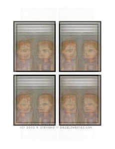
Diesel Sweeties strips 1-800 (Volumes 1-4 PDF)
Later on, DS changed its templating a bit. We see some differences in panel structure, in Volume 5 (over 800 strips in), then guest comics, etc. and it all becomes fuzzy (although the different panel structures are pretty clear).
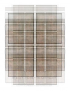
Diesel Sweeties strips 801-1600 (Volumes 5-8 PDF)
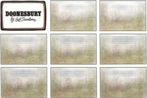
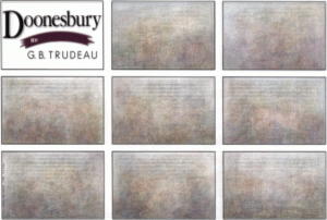
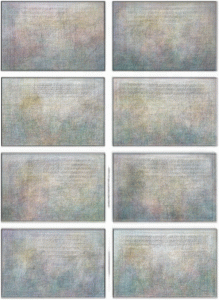
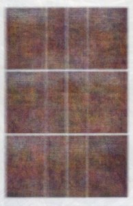
If we go a bit older, to Doonesbury Sunday strips from the 1979, 1989, and 1999:
You can see that Trudeau stuck to a pretty standard 3×3 grid during his Sundays in the ’70s, used the same unmodified title card as panel 1, had the freaky often-brown color scheme indicative of the ’70s, and kept the dialogue above characters’ heads in a particular position. Other than that, not much to say about the average.
In ’89, the colors are bluer (coloring the sky, for example) and the title card is different. Other than that, we’re still in the rigid 3×3 structure. Um, fun.
In 1995, papers started changing layouts and decided to give Trudeau less space, pushing him most of the time from a 3×3 grid to a 2×4. For most of the time (like all of 1999) that meant no title card. (There was a good run in 1996, though, where he decided to do just 7 panels of content with the title card intact.)
Dinosaur Comics is an extreme case of this panel rigidity, but for ironic reasons rather than business-enforced. Since every strip uses the same exact layout, only changing the text spoken by the characters, it should be expected that the pictures and panels are the same in the average. They certainly are:
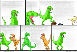
Dinosaur Comics 100-strip average
Note, however, that the more we average, the more we see that the whitespace between the letters of text overtakes the text itself; in effect, we find that the “average” Dinosaur Comic, in the long run, has just a blur of… is that zeroes? Did Tyrannosaurus Rex discover the notion of nothingness? How profound, wizard.
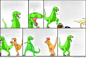
Dinosaur Comics 200-strip average
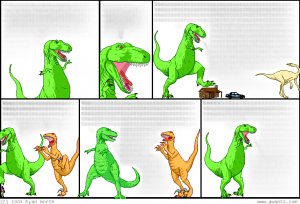
Dinosaur Comics 500-strip average
Back to paper strips: even Bill Watterson was not exempt from the rigid panel standards of the newspaper syndicates. Early in Calvin & Hobbes’ run, Watterson kept Sundays pretty solidly in a 4×3 panel structure, with mild changes usually in the middle row, and the title always in the same position and style…
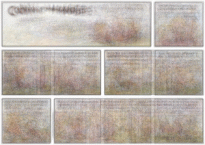
Calvin & Hobbes Sundays (1986)
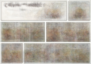
Calvin & Hobbes Sundays (1989)
… but then he took control, using multiple unorthodox panel structures, putting the title wherever the hell he wanted, and on the average, everything becomes a blur, with a faint glimmer of a 4×4 panel structure underneath.
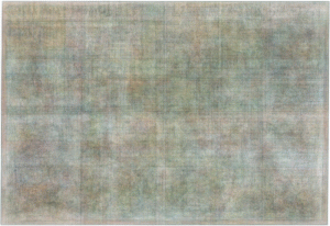
Calvin & Hobbes Sundays (1992)
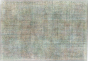
Calvin & Hobbes Sundays (1995 – last year)
Switching now from webcomics and strips to that unnameable medium currently referred to as “graphic novel” – how to average this type of comic? We’ll go by page instead of by day. Two examples: Alan Moore, Brian Bolland, and John Higgins’ The Killing Joke is a bit short to average, but does have noticeable panel structuring, and a LOT of purple.
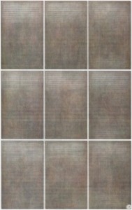
And, just for the hell of it, since it’s apparently Watchmen Week here in Sequential Art Village, here’s the first 3 chapters:
Pretty solid 3×3, with page numbers, and if you squint you can see the clock from the last page of each chapter. Due to the number of pages of almost-all text, and just the fact that it’s an incredibly dark comic, this is darker than a typical comic average.
Conclusion
What’s wrong with these averages in general? Lots. Artists change styles, so things may change over time. Panel structure might build up or break down. Characters, while the primary similarity between panels/pages, will be in different spots. Doing a pixel-by-pixel comparison clearly isn’t enough to get a real grasp on the “average”. The best way? Read them. A lot of them. Know your artists.
As educational artifacts, the averaged images are licensed under a Creative Commons Attribution-Noncommercial 3.0 United States License, subject to the actual copyright owners’ whims. Attribution to the original creators and myself is required.
Michael Carlisle is a mathematics Ph.D. candidate at the City University of New York’s Graduate School and University Center (”Graduate Center”), where he earned a certificate in Interactive Technology and Pedagogy. When not teaching or researching probability, rambling on about dystopian films and surrealist animation, or non-ironically calculating the odds of finishing his thesis instead of doing it, he volunteers with the Sequential Art Collective and New York Center for Independent Publishing. He has more data than you.


No comments yet.